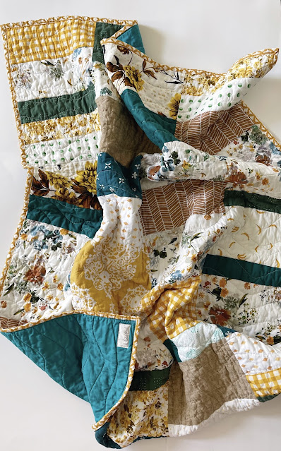
When I started to get back in my quilting groove, all of the quilts I started making were in soft and easy color palettes. I shared the two I made here (at the bottom of the post) and here
After all that soft, I needed something bright and bold.
I make this design often and the point of it, in my mind, is to let either the color or the fabric steal the show. I like bigger block sizes to show off the color and let it really saturate the quilt, also to show off a print in a fabric that I love.
This quilt was a combination of both. And I should say, I would not normally put bright green-leaning teals, rich yellows, and tans together, and mid way through cutting out blocks, I stopped and took them to Kaiti and asked her if I should stop and forget about it. But she told me to keep going, it would look better when they were all next to each other. I am glad I listened to her.


No comments:
Post a Comment